Architectures of Time

Wednesday, November 16, 2005

Electronic Disturbance Theatre :

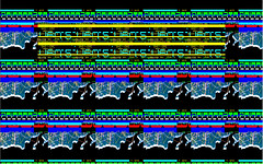
The Electronic Disturbance Theatre (EDT) to be continued.......

Requiem for a dream - by Hi-Res

Requiem for a dream

In their website for the film “requiem for a dream” again designed by the exceptional company Hi-Res, is a perfect example of how net.art is used for corporate projects. It uses a similar language as net.art to undermine the security of the user interface to express the consequences of technology failing. The site slowly decays, with corrupted images, unexpected links and broken text; this is supposed to mirror the gradual unravelling of the characters lives within the film. It also mirrors how fragile our lives are and how much control we have over things by the technology failing.

As you travel thought the site you experience random interfaces which as you click them, break up into pieces then disappear into nothing then link to the next page. On the first screen you come to when you log onto the website you don’t actually think you are on the right site because it the says the site is called “tappytibbons.com” but as you click the page it breaks up as thought you have a glitch in your system then loads the “requiem for the dream” text so it is clear you have the right site.
The site contains many references to the net.art movement such as a the pages breaking up like you have a virus, random text appearing on the pages, distorted images, random pop-ups, loads of cursors and windows functions which normally appear when something cant be displayed. ASCII images can be seen in certain pages in the site.

It is clear to see that this site has taken its influences from net.art movement you navigate though the site not really knowing where you might end up, this is very similar to net.art work such as Jodi as you are just take from page to page without any clear structure. I feel this is the best site that I have seen which clearly has turned net.art from being an experimental art form, into a corporate project, which combined net.art with the design constraints of a design company.

KEY points:
· This website shared common visual representation of net.art but Hi-Res do not consider there work to be art they see it purely as a specific site for a film
· The first page is a reference to the film but you would not know this unless you had seen the film.
· This website won many awards such as the D&Ad Award 2001, and Best interactivity.
· There is information hidden within the site, which you don’t always notice unless you study each page.
· Interactive website which for most of it requires the user to interactive others wise it just remains static.

corrupt

corrupt page

ASCII image

Soulbath - corporate project by Hi-Res

www.soulbath.com

Soulbath.com is an experimental website exhibiting web banners, the interface is what you would expect to see on a net.artists website such as Jodi or Vue Cosic. But instead on this page you are seeing net.art designed by a corporate design company.
Soulbath.com was created by the experiemntal design company Hi-Res, who are know international for there left field approach to design, with no in-house style every project looks different.

The website includes flashing text and interaction to progress to the next page, such as typing a “y” to move on though the site. The website takes advantage of the fact that often people don’t absorb information in bright colours that speed by, instead of just using bright colours on their website they decided to use a colour only a few degrees away from the background colour so it makes it differcult to read the text. In the world that we live in at the moment people do not have the time to actually read all the information and decide weather its any use or not. The secound page has a banner ad with moving text in it, because the text is moving at a speed which makes it hard to read the text most users would just think that it was not important information.

This is how Hi-Res have described there website:
"If we only use enough different colours and lots of banners on this site, people will actually believe it has some genuine content and is popular when actually the opposite is the case. What you see here is completely useless information, but is flashing so brightly, that you have no way of knowing in the beginning if there may be some information underneath all of this." With this website Hi-Res are making a very loud statement about the shallow consumer world in which we live. An example of this is the ASCII dinosaur on the site that is made up of dollar signs. This is similar to the work produced by vue cosic, in which he produced images using ASCII.

KEY points:
· Hi-Res were founded in 1999 and have become very quickly leading figures in the design industry.
· They jumped head on into the web with the creation of soulbath.com
· Hi-Res have produced many websites for big blockbuster films such as “Donnie Darko”, “Requiem for a dream” and “Saw II”.
· “Sawmovie.com” is an especially interesting site, althought it only have a few refrences to net.art it is an expectional narrative driven site.
· Soulbath.com uses a similar interface as net artists use on their sites but this website has more of a crisp, minimalistic approach compared to sites such as text.jodi.org/

(for images see blog below)

Carnivore :

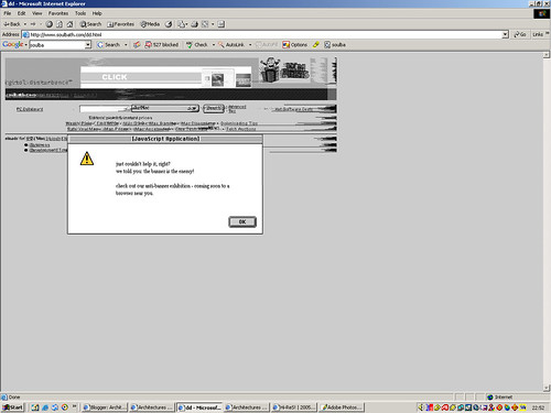
Im sure many of you have heard of the FBI's Carnivore project.

This was basically a project that sniffed packets that travelled acros the network on which it was installed. The idea behind this project was that it could be used as a form of intelligence gathering for homeland security.

The program would be set to scan all emails passing through an ISPs' server and would check for the existence of key terms or phrases within the email. This information would then be gathered into a large database system where it wold undergo further analysis.

Privacy rights activists and campaigners protested and the project was abandoned in favour of a comercailly available application in January of this year.

The Radical Software Group developed CarnivorePE, a "surveillance tool for data networks".

Using this application, many different artists have created their own Carnivore Clients.

One such example is Police State by Jonah Brucker-Cohen. This client uses Carnivore to sniff packets on the local network, searching them for terms related to domestic US terrorism.


The terms found are parsed and assigned a police code (10-79 - Bomb Threat,1000 - Plane Crash etc.) These codes are then converted into binary and then become movement instructions for a fleet of 20 r/c police cars.

The cars move in sync with each other as the information is gathered straight off of the network. The movement of the cars is paired with recorded audio of police sirens and an officer issuing statements over a radio.

The specific information being gathered is similar to that which the FBI intended to gather with the original incarnation of carnivore. By using that information to then control a fleet of police cars , "the police become puppets of their own surveillance" says Brucker-Cohen.

Although not specifically net.art I felt that this work should be included. It is a brilliant example of how information gathered and used by a government agency such as the FBI can and has been used to create works of art.

Stock Market Skirt :

The Stock Market Skirt is an installation project by Nancy Patterson.

The project displays the current market value of a specific stock through a "blue taffeta and black velvet party dress is displayed on a dressmaker's mannequin or 'Judy,' located next to a computer and several monitors of varying sizes".

The skirt is wired with a stepper motor that controls a system of weights and pulleys that alter the hemline of the skirt.


The data itself is obtained using a number of PERL scripts which are run on a Linux box. The current value of the stock is displayed on a series of monitors which surround the mannequin.

As the price of the stock rises, the skirt hemline also rises. As the price of the stock falls, the hemline follows suit.

The concept of this piece is based on an investment myth that can be found on Investopia.com -

"The idea that skirt lengths are a predictor of the stock market direction. According to the theory, if skirts are short, it means the markets are going up. And if skirt are long, it means the markets are heading down."

Of course this is just a myth, perhaps a coincedence. The analysis states that shorter skirts are worn in times of a boom, when the markets are doing well and people are generally happier and more excited about things. Longer skirts are then said to be worn during slumps in the market when people are generally worried or depressed.

The installation is simple both in terms of its delivery and its concept and yet it is more complicated. A viewer can interact with the installation over the internet by buying or selling stock in the company currently being tracked by the software. Initially this would have to have been done by placing a phone call to their broker, but could now be done using an online brokerage.

Sunday, November 13, 2005

They Rule

C.wright wrote a novel many years ago called "The Power Elite", it documents the inter-connections of the most powerful people in the USA. In today's world people who are the heads of companies often swap on and off boards from one company to another and in and out of government committees and positions. Most of these people run some of the most powerful companies on the planet, and it is difficult for us to know whom this people are. This is were "They Rule" becomes very important it allows users to browse though interlocking directories of some of the biggest American companies.
“They Rule” was created by Josh On who joined Futurefarners in 1998, from the Royal College of Art in London, he is a interaction designer who focuses on social software. He tries to make tools that help people be smart rather than tools that try to be smart for people
KEY points:
· The data that "They Rule" used was collected from the companies websites and SEC filings in early 2004,
· Companies merge and disappear and directors shift boards, it is difficult to keep things up to date, so it may not be completely accurate.
· On the Futurefarmers website “they Rule” is described as a” toy for Futurefarmers.”
· They rule allows people to easily browse though companies and run searches on them.
· You can save maps and annotations for others to view
· 90% of the boards have a director who is also on the board of another 100 companies
· Net.art artists often use the same software as corporate project.


Net.art artists go beyond the normal line that designers would cross; one of health bunting projects was to get people to fill in the loyalty forms for tesco, which have no association with tesco. Health put all the information he had collected about the customers and put it on the web for all to see.(not sure bout this you can change it if u want, coz u know more about it) This is very similar to the “They Rule” website project as they are both allowing people to see information which we normally don’t have access to.
“They Rule” is created using a database visualization software similar to which is used to create The Visual Thesaurus.


they rule

Heath Bunting :


Heath Bunting is a british artist, currently residing in Bristol. Another of the co-founders of the net.art movement Bunting's works tend to deal with political issues such as CCTV surveillance in our towns and cities, Network Collision research in conjunction with CERN as well as a number of anti-corporate campaigns.

Heaths projects are often internet based and usually rely on people from across the globe participating or signing up.

Projects such as the 'Cultural Terrorist Agency' have been undertaken to tackle large corporations, that are usually left alone due to their enormous bank balances and the power they can be used to obtain.

Both of my artists, unlike those researched by Nicola, seem to have their own personal agendas but these are not easily represented to those outside of the net.art community.

That being said, after reading an interview between Heath Bunting and Josephine Bosma, Bunting's motivations are clearer.

The article ask the question, "Street Artist, Political Net Artists or Playful Trickster ?" about Bunting and the interview itself seems to define him as a bit of all of them.

He made his mark on the streets with his chalk tagging works (which he describes as being, "scratches and scriblings of a roaming irationalist.").

The Status Project which is described by Rhizome.org as being a project which " consists of a database of Do-It-Yourself strategies to meet the bureaucratic requirements for the possession of official identification – from birth certificates to passports -– allowing its users to create or dissolve identities as well as to merge two different peoples’ identities. Large-scale prints plot a user’s official status creating maps not based on residency, citizenship or birthright but on mobility."

This project as well as the Tate Modern sponsored BorderXing, which is only accessable from a number of registered client systems across the globe and looks at the journeys taken across international borders without interference from border patrols, customs or imigration, shows his political stand point and his views on society and each of its' different classes and structures.

As for being described as a playful Trickster? This side of Bunting comes across in the majority of his works. His CCTV Sabotag project uses large format prints of people obscuring themselves whilst in the gaze of a CCTV camera. The project plays on the perspective that the camera must view the scene from. It is clear to someone physically present at the scene that the 'person' is really just an image placed on the ground.

So Heath Bunting comes across as an intellectual prankster - using his artistic talents to create projects that both entertain and inform, documenting social networks and the various structures within them.

2nd screen -Scott Patterson

Since leaving Thinkmap Scott Patterson has begun to explore architecture as an interface between the activity of our daily lives and the space of the digital network. PDPAL is a mobile and PDA based mapping and storytelling project. PDPAL is a multi-component public art project that allows audiences to map their own personal vision of public space. It pushes the notion of mapping and attempts to transfer your everyday activities in to a dynamic interface. This is a quote from the PDPAL website about what the project is about “PDPal engages the user through a visual transformation that is meant to highlight the way technologies that locate and orient are often static and without reference to the lively nature of urban cultural environments.”

KEY points:
· PDPAL a.k.a Personal Digital Pal
· Guided by a streetwise urban and witty park ranger.
· A project for palm PDA’s, mobile phones and the web.
*Scott Patterson wanted to explore architecture as an interface


pdpal pic 2

First page- Scott Patterson

Scott Patterson is an information architect and interactive designer. He joined the design company Plumb Design in 1999, when he joined the company there was no real specific job role for him, so he created his own. He was a liaison between the design and technology departments, they called this role Technical producer.
While he was with plumb design he helped to create The Visual Thesaurus, he was the site developer on this project.

The Visual Thesaurus is a tool to explore, study and analyse the structure of language. The project was created using java based visualization software, which helps to create dynamic interfaces. All the data for the Visual Thesaurus is accessed off a publicly available reference system, Word. net. It is accessible to a wide audience and explores a clear relationship between words.


KEY points:
· www.plumbdesign.com
· Plumb design was founded in 1997, and then in 2004 they changed their name to Thinkmap .inc, to better represent their software
· The visual thesaurus displays interrelationships between words and meanings as a spatial maps, translates information into a visual architectural map.
· It maps out every word and will eventually map around to the original word you started with.

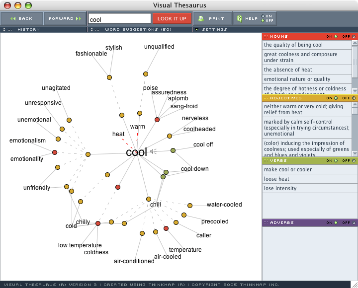
The Visual Thesaurus shows us how times have changed, and that people are not just content with using a book anymore. They want it to be easy as well as being more accessible with all the information at the touch of a button.
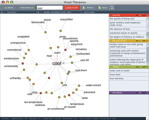
Visual thesaurus

Vuk Cosic :


The first of my artists that I researched was Slovenian Vuk Cosic.

Vuk was one of the co-founders of the net.art movement. His site documents some of his many works. The majority of which show his passion for ASCII art.

These works range from creating ASCII textured worlds in Unreal Tournament, creating entire movies where each individual frame is created using ASCII characters and also projecting an ASCII rendering of a building onto the building itself.

Unlike most artists who embrace the latest technologies into their work whenever possible, Vuk seems to do the opposite. He takes older technologies (such as ASCII) and attempts to utilise them for more modern projects.

Vuk's passion for ASCII stems from a quote made by the former Serbian Minister of Culture - Mr. Danilo Ž. Markovic who said the Serbian Cyrillics where "not only the most beautiful script but also the most suitable for work with computers".

Vuk also references the fact that the first Serbian Cyrillics where preinted in Vienna, Austria by a man named Vuk.

Whilst researching this subject I also came across this app. which generates ASCII art from a JPEG, GIF or PNG and allows it to be saved either as an image or as a text document.

2nd page -Jodi

Jodi forces us to question the representation of data, its translation; it’s mapping, and the programming language as a visual element.
In their pages they re-invent the way we see the Internet, instead of us seeing the image on the page, and the code in the source, Jodi reverses this process and we see the code on the surface and the image in the background.

An example of this is wwwwwwwww.Jodi.org/ Jodi’s homepage, which consists of meaningless text, until you look beyond the interface into the source code, which reveals a detailed diagram of a hydrogen bomb.
Jodi’s work challenges expectations of the behaviour of the computer and creates humour from the misery of glitches and virus’s. Jodi uses this site to reveal the inner beauty of the web.

KEY points:
* Their pieces only work well, when viewed in their intended environment – ‘The web’
* Sites are no used to present information
* Jodi’s sites:
Map.jodi.org/
404.jodi.org/
oss.jodi.org/
sod.jodi.org/
text.jodi.org/


wwwwww.jodi first


sorce code jodi

First screen -Jodi

JODI

Jodi is a Dutch design group comprising of Joan Heemskerk and Dirk Paesmans. They are central figures in the net.art movement; they have set measures and standards against which all other works in their genre are compared to.
Jodi transfers processes, which normally occur in the background onto the surface of web pages, this is now, know as Net.art, or browser art.
Their websites are very effective and in a sense beautiful, they flash and burn with random scrolling, uncontrollable programming code, and fragmented shards of interface elements. Jodi have said that they could shut down everyone’s computer with one line of code, buts that not interesting. But as I have found out some of Jodi’s websites do crash your browser or even your whole system.Jodi put their work onto screen immediately without any press releases and without their bio’s. They say this is because ‘when you look at a exhibition, people are sniffing for information plates next to the pieces before they even look at the work itself. They want to know who did the piece before they have an opinion about it, we try to avoid that.’ When Jodi first website was put onto the Internet people seriously thought they had made a mistake. They got many emails telling them how to correct their problems.

KEY points:
* The first two letters of their names Jo and Di create Jodi.
* Net.art is their Internet project, which simulates browser bugs and system errors
* Net.art strips away the glamour of the Internet, and immerses the user in a well ofdata,which resides beneath the surface.
* They explore the computer from the inside and mirror it on the net.


wwwww,jodi 2

Thursday, November 10, 2005

Soulbath by Hi-Res

This is a project by the company Hi-Res:

"Since the beginning, High-Res! has been on a completely different level than other Internet design companies. They resist consumer culture through a variety of tactics: pushing the web to its technical and artistic limits; attempting to bridge the gap between the digital medium and the real world; and creating experiences rather than passive viewings. They have been recognized for their unique work on websites such as www.thethirdplace.com, www.requiemforadream.com, and www.dieselstylelab.com. Their work has such a distinctive feel to it because they manage to create a three-dimensional experience in a two-dimensional setting." (quote from"http://www.dartmouth.edu/~arthist/content/websites/
website7/website7.html")

The site is an experimental website exhibiting web banners, but am not really looking at what it does I just like the interface used.
The interface is what you would expect a net.art such as Jodi or Vue Cosic to create but here it is being used by a corporate design company.
Here are some images of the website:

first screen

pixel art

banner

ad

(images taken from www.soulbath.com)

"Flashing windows displaying colorful banners take deliberate advantage of the fact that in our consumer culture, people are less likely to absorb information in bright colors that speed by. In other words, there is too much to pay attention to and not enough human capacity to grasp it all. "If we only use enough different colours and lots of banners on this site, people will actually believe it has some genuine content and is popular when actually the opposite is the case. What you see here is completely useless information, but is flashing so brightly, that you have no way of knowing in the beginning if there may be some information underneath all of this. In the case of soulbath.com, there is . . .". It is easily concluded that Soulbath is making a commentary on the level of the shallow consumer society in which we live. Another example is the ASCII dinosaur that is almost completely composed of dollar signs. This speaks to the lengths that advertisers go to convey their messages. " (quote taken from same website as before)

Net.Art


Net. art is simply not just a place to display an artist work it is more about the artist using that space to create a piece of art. When I look at net. art especially by artist such as Jodi I wonder what made them come up with that idea. This is made even more apparent when I sit down to try and create a something the style of their work and realise that it’s not as easy as it looks.

The main idea of net. art seems to be a hyperlink though which one page can be linked to another, no matter where on the internet that page is, which means potentially these artists have millions of links on which to create work.

When I was researching in to my artists I made a list of the main things that I thought made up the world of net. art:

* hyperlinks
* Colourful patterns or pictures
* Flashing text
* random scrolling
* simulating virus or glitches
* using a programming language to create a image
* mapping the Internet or links to the Internet
* error messages
* and many more

When you look at these elements you see that a lot of these things are being used more and more in corporate projects.

They Rule

C.wright wrote a novel many years ago called "The Power Elite", it documents the inter-connections of the most powerful people in the USA. In today's world people who are the heads of companies often swap on and off boards from one company to another and in and out of government committees and positions. Most of this people run some of the most powerful companies on the plane, and it is difficult for us to know whom this people are. This is were "They Rule" becomes very important it allows users to browse though interlocking directories of some of the biggest American companies. The data that "They Rule" use was collected from the companies websites and SEC filings in early 2004, but as companies merge and disappear and directors shift boards, it is difficult to keep things up to date, so it may not be completely accurate.

The reason I have chosen to look at this project, as I feel it is a very corporate project, which has the influence from net. Art movement. When you look at net. art you often seeing just a lot of random text, which makes no sense to you unless you look beyond the surface. I feel that this project has a similar feel, when you first look at it you wonder why the creator would want to make this, but once you explore more of the project you realise it has a very useful and interesting meaning. It also I draws some of its influences from the net. art movement as it has been created purely for the Internet, this project would not function or have the same impact if it was not viewed on the Internet, and this is the same as with most net. art projects.

they rule
Produced by Futurefarmers

cool sites

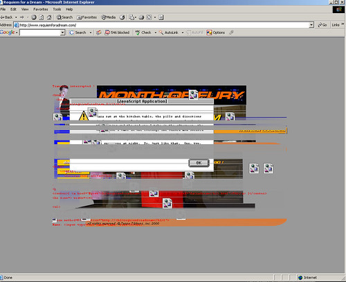
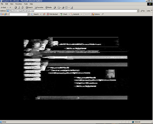
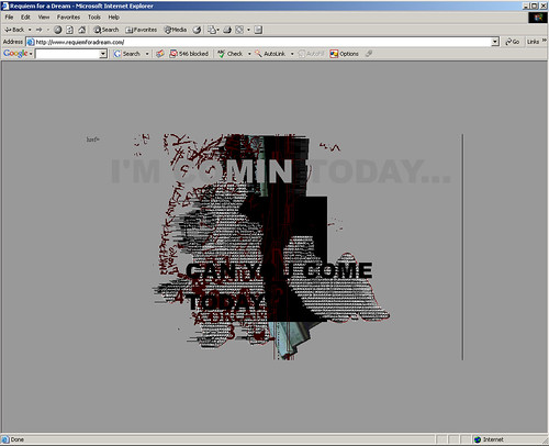
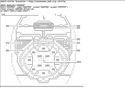
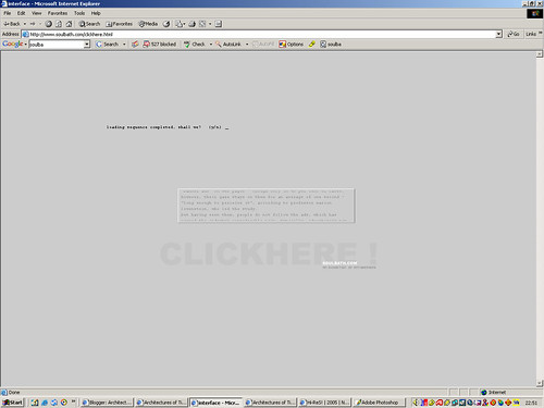
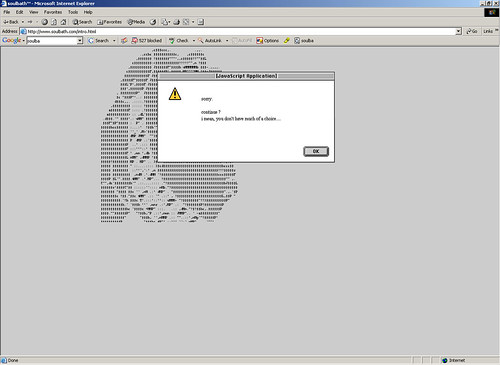
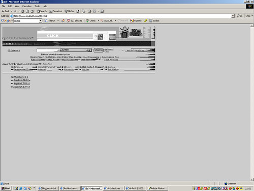
There is a cool website which uses ASCII, heres what it is about and the link below:
"LinX3D is a 3rdWeb MultiUser game on ASCII loginfiles datavatars and linked to a RL hardware console.
Textbased information is imbedded as texture in LinX3D.These avatars are generated from netprotocolls.The console acts as a real life interface. The ASCII-face of the spect-actor is generated and displayed simultanously the online 3rdWeb game. Players meet real at the various RL installation sites and online in the electronic net."

http://www.konsum.net/linx3d/

this is a website by NEC:
https://www.ecotonoha.com/index_en.html

Saturday, November 05, 2005

Visual thesaurus


Thinkmap.com

In Visual Thesaurus in which Scott Patterson’s was the site developer, it is used as a tool to explore, study and analyse the structure of language, to display interrelationships between words and meanings as a spatial maps. The visual thesaurus accesses data from Word net, to create its clear yet functional design.

jodi map

map.jodi.org/

Jodi took a diagram with all the back bones and names of major provides and replaced the names of technical provides with alternative art sites on the net with links to each of these sites. This takes information from the Internet and connects them using the map.

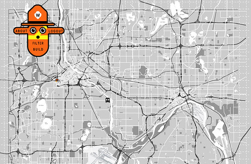
For our presentation we decided that it might be a good idea to create a title on which to base our presentation, to help to structure our thoughts more affectively.

How has net.art influenced corporate projects?

Friday, November 04, 2005

Scott patterson

Scott Patterson is an information architect and interactive designer. He joined the design company Plumb Design (www.plumbdesign.com) in 1999 when he joined the company there was no real specific job role, so he created his own. He was a liaison between the design and technology departments, they called this role Technical producer.
Plumb design was founded in 1997, and then in 2004 they changed their name to Thinkmap .inc, to better represent their software.
While he was with plumb design he helped to create The Visual Thesaurus, he was the site developer on this project.

The Visual Thesaurus is a tool to explore, study and analyse the structure of language. The project was created using java based visualization software, which helps to create dynamic interfaces. All the data for the Visual Thesaurus is accessed off a publicly available reference system, Word. net.
Since leaving Thinkmap Scott Patterson has begun to explore architecture as an interface between the activity of our daily lives and the space of the network. PDPAL is a mobile and PDA based mapping and storytelling project. PDPAL is a multi-component public art project that allows audiences to map their own personal vision of public space.

Jodi websites

www.jodi.org/
map.jodi.org/
404.jodi.org/
oss.jodi.org/
sod.jodi.org/
asdfg.jodi.org/
text.jodi.org/
wwwwwwwww.jodi.org/
www.wrongbrowser.com
www.untitled-game.org/

Jodi

Jodi is a Dutch design group comprising of Joan Heemskerk and Dirk Paesmans, the first two letters of their names Jo and Di create Jodi. They are central figures in the net.art movement; they set measures and standards against which all other works in their genre are compared to.
Net.art is their Internet project, which simulates browser bugs and system errors; Jodi transfers processes, which normally occur in the background onto the surface of web pages.
Their website is very effective and in a sense beautiful their WebPages flash and burn with random scrolling, uncontrollable programming code, and fragmented shards of interface elements.

Jodi forces us to question the representation of data, its translation; it’s mapping, and visual the programming language as a visual element.

wwwwwwwww.Jodi.org/ is Jodi’s homepage, which consists of meaningless text, until you look beyond the interface into the source code, which reveals a detailed diagram of a hydrogen bomb. Jodi’s work challenges expectations of the behaviour of the computer and creates humour from the misery of glitches and virus’s.

Saturday, October 29, 2005

My artists - Nicola

For this project we were given two different artists to look at under the overall term of mapping. The first design group that I was asked to look at were Jodi, Jodi comprises of Joan Heemskerk and Dirk Paesmans. I was also asked to look at Scott Patterson and Plumb Design with reference to The Visual Thesaurus, Scott Patterson joined Plumb design as a site developer and technical producer, while he was with the company he helped to create The Visual Thesaurus.

Introduction:

The purpose of this blog is to document the research that both Nicola and Myself have gathered for our Virtual Environments module - Architectures of Time.

Yes it is really as abstract as it sounds but hopefully as this blog develops over the next few weeks, the subject and our views concerning it shall become clear.

The overall outcome of the project is a joint presentation to the rest of our year group and each of us shall be creating some form of 'map' which shall act as a guide to our research and will show the journeys we have each taken to form our conclusions.

If the formats permit, I may post each of the finished pieces within this blog (or at least a link to them if they are hosted elsewhere).